Ressence Series One: Type 1003 – Reviewed

Not just hands-on, but our contributor Max got to wear the Ressence Type 1003 for some weeks. For a good review, that’s what you need to do, to get a good idea of how a watch really is on the wrist, how it is to look for the exact time and if it “suits you”.
“Look Mom, No Hands,” said this young lad as he lifted his hands off the bicycle’s handlebars; the young lasses took notice. When I rode my first roller coaster, the same declaration of freedom accompanied the coaster’s headlong plunge into oblivion, “Look, No Hands.” There is bravado to the handless claim, which at once defies convention and throws caution to the wind. Freedom. The owner of a Ressence Series One can thrust his wrist toward the sky with equal claim, “Look, no hands.”
?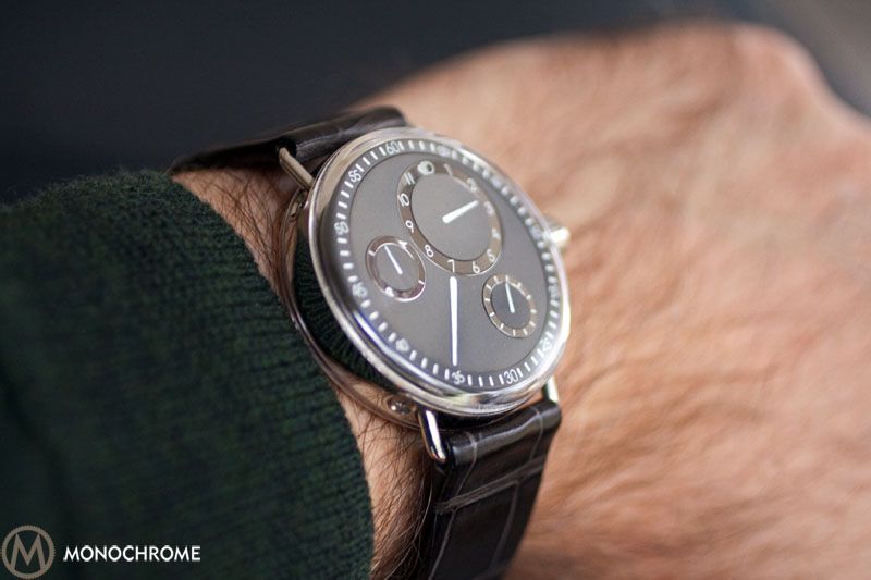
Having spent several weeks with the Series One Type 1003, I feel speechless, which is a dangerous condition for a journalist. Having admired this watch since its introduction, receiving it recalled memories of Christmas morning, and the watch exceeded my expectations. As simplistic and understated as the minimalist design is, its effective brilliance leaves an impression; people notice.
The company name, Ressence, is a contraction of Renaissance and Essence (literal French translation is Renaissance of the Essentials), signaling a renewed approach to the watchmaking craft. The Type 1003 doesn’t scream, it doesn’t jump up and down, the watch sits there quietly, unassuming on the wrist, with its conceptual wisdom on full display. As da Vinci said, “La semplicità è l’ultima sofisticazione.”
?
Overall Appearance
The only true hand that you will find on the Ressence is its logo with an outstretched hand offering a handshake. Instead of moving hands, the watch has moving dials with applied pointers. The logo’s universal humanitarian gesture reflects the gracious spirit of the company, which Belgian creative Benoît Mintiens founded, interrupting a prestigious industrial design career to start a watch company. Ressence is more than just another watch company; it is living inspiration. Just as Mintiens has left his industrial signature across Europe, so he makes an indelible impression with the Ressence Series One.?

When the inaugural Zero Series first hit Basel in 2010, it created a stir. Journalists kept commenting about how it looked exactly like the Harry Winston Opus X, and at a glance, there are similarities that end at the level of appearance. The differences of how the watches work, the genesis of their designs, and their independent construction led Harry Winston and Ressence to meet and agree that though there are resemblances, the two watches reflect different concepts. Distractions aside, Ressence was free to boast, “Look, no hands.”
?
The Series One, progeny of the Zero Series, carries forward the astronomical design of rotating dials. Cue Gustav Holst’s symphony on the Planet Jupiter while recalling Galileo’s use of Jupiter’s four moons, also known as the Jovian or Galilean Satellites, to measure time. Galileo discovered that Jupiter eclipsed its moons one thousand times a year and with such a horological predictability as to be heaven’s clock. The Ressence Type 1003 with its orbital dials recalls such celestial magnificence. The sub-dials traverse the face of the watch, displaying time in cosmic fashion.
 ?
?
Dial/Non-Hands
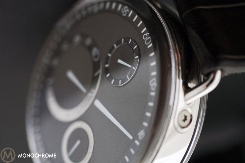
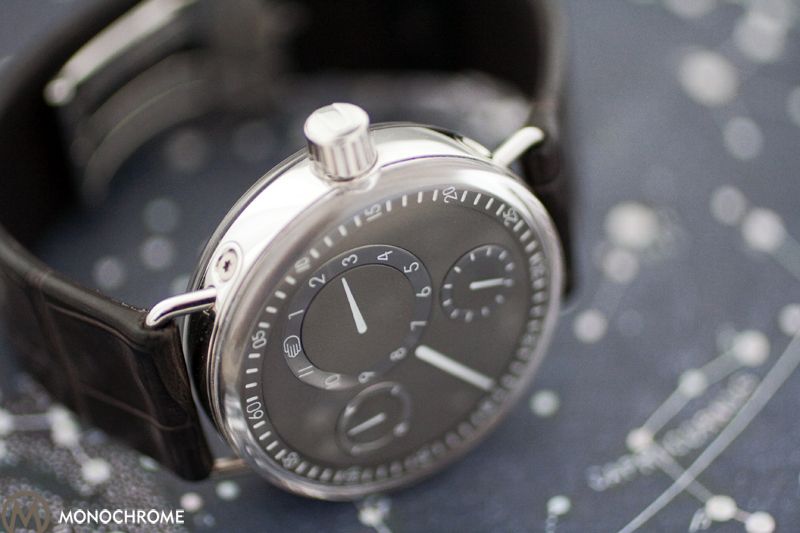
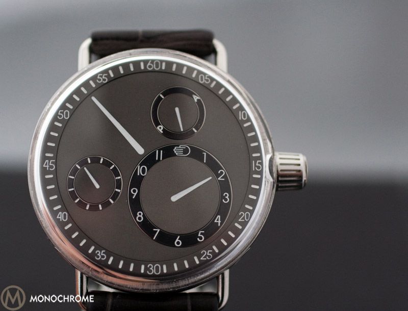
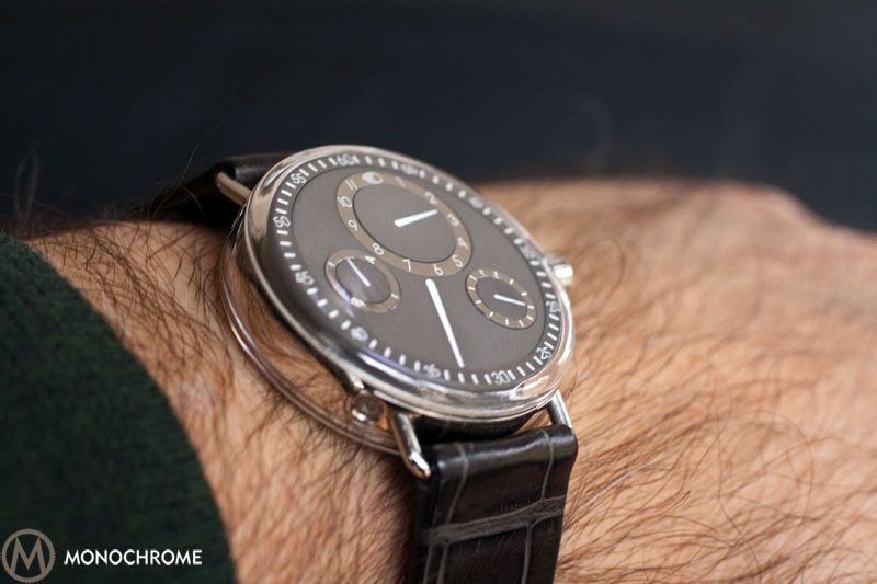
One of the things people notice about the Series One is its distinctive way of measuring time. Instead of hands, these Ressence watches use four rotating dials equipped with applied white pointers, which rotate inside chapter rings. In the fashion of the Biblical Ezekiel’s vision of wheels within wheels, there are dials within dials. The largest dial contains a pointer for the minutes, which sits as a comet’s tail underneath the hours sub-dial, and the pointer tracks along the watch face’s circumference. Inside the larger dial are one larger hour sub-dial and two smaller sub-dials. Highly polished steel chapter rings respectively etched with the hours, seconds and 24-hour indications surround each sub-dial. As the dials move, the steel chapter rings remain in a stationary orientation and orbit around the watch face. The entire watch face or dial is flat. This flush presentation is a signature departure from the familiar 3-D method of representing time.
The homepage for the company website allows you to see the dials in action, and the page is located here: http://www.ressence.eu/.
Once I got the hang of looking for the hours on the sub-dial chapter ring and the minutes on the dial’s fixed peripheral chapter ring, then all I needed was a glance to tell the time. Mintiens shares, “The origin of the dial concept has been the observation that reading time on hand/dials, when trained, is faster than reading digits. The human brain has developed cognitive patterns that translate an image projected by the position of the hands into time conception. This knowledge has become universal.” All it takes is a reorientation from the traditional moving-hands’ spatial representation of time to a new orientation with moving-dials, but the same cognitive process is at work.
?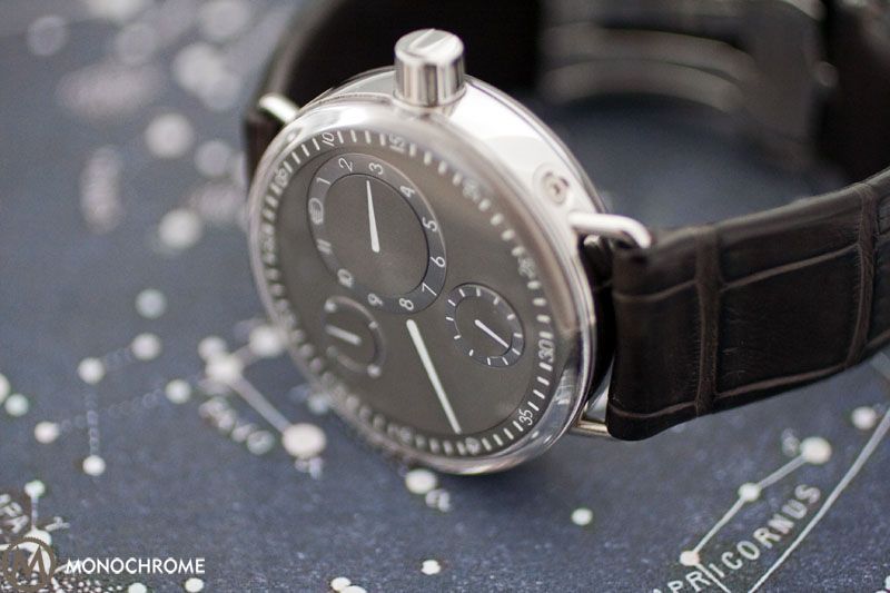
Of particular note is the color of the titanium dial. Is it grey? Is it brown? Both. Some describe the dial color as a natural warm color, which fails to convey its wonder. With changing light conditions, this chameleon dial will subtly shift its color like a lizard’s camouflage.
The ghostly green lume shines brightly in the dark, allowing for constant visibility by highlighting the pointers and the chapter rings. The lume is bright. See Frank’s praise and pictures of the prior Zero Series lume here.
 ?
?
Case/Strap
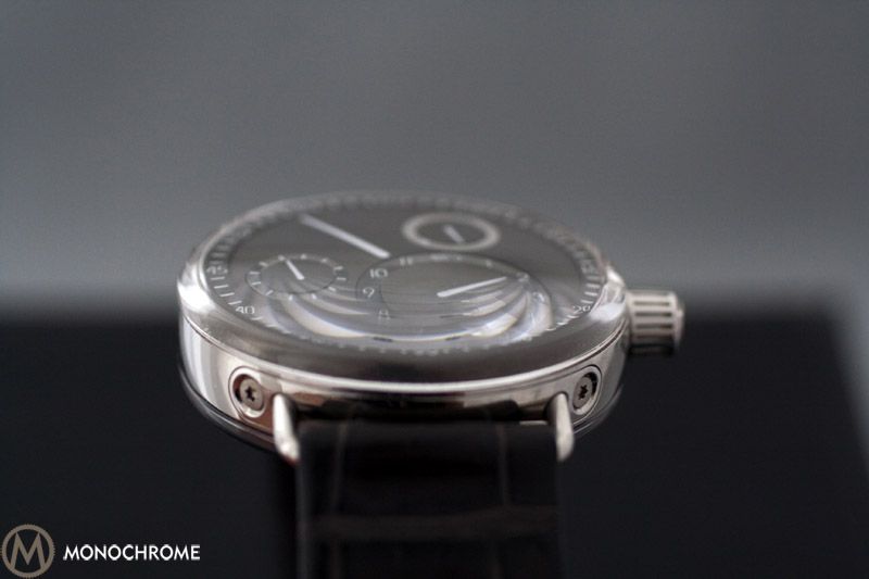
The case is limited to its wide steel barrel, sandwiched between front and back wrapping crystals. The upper crystal envelopes the dial with both extending vertically down the case side, visually uniting the crystal and dial. Instead of the visible case back screws of the Zero Series, the Series One has a crystal glued to the chassis. Because the upper crystal wraps around the side of the watch, it creates a slight distortion when viewing the dial at an extreme angle; an idiosyncrasy that I find endearing. The wire lugs fit to a removable screwed-in plate whose screws add an industrial touch. The lugs angle downward increasing the watch’s comfort. The paucity of steel casing makes the dial the watch’s focal point, or one might say the focus is on telling time, which gets at the essence of horology. Inaugurating a renaissance, even.
?
Considering the rest of the case, the crown catches the eye. To house the locking mechanism, the crown, really more of a cone, has significant extension, but this also provides added grip for the turning. Never did the crown bind into my wrist; overall, the watch was comfortable to wear, and the watch’s weight felt negligible. At 42mm, its size hit the sweet spot for me, and though large, the watch appears reasonable on the wrist.
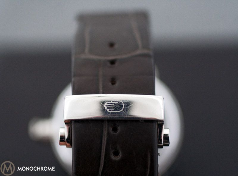
The strap has a cylindrical button release and mono-deployment clasp. The Type 1003 was easy to put on and take off, and I prefer the mono to the butterfly deployment clasps. The alligator strap adds to the luxurious presence, and the strap has a worn, almost vintage, feel.
?
Movement and Crown
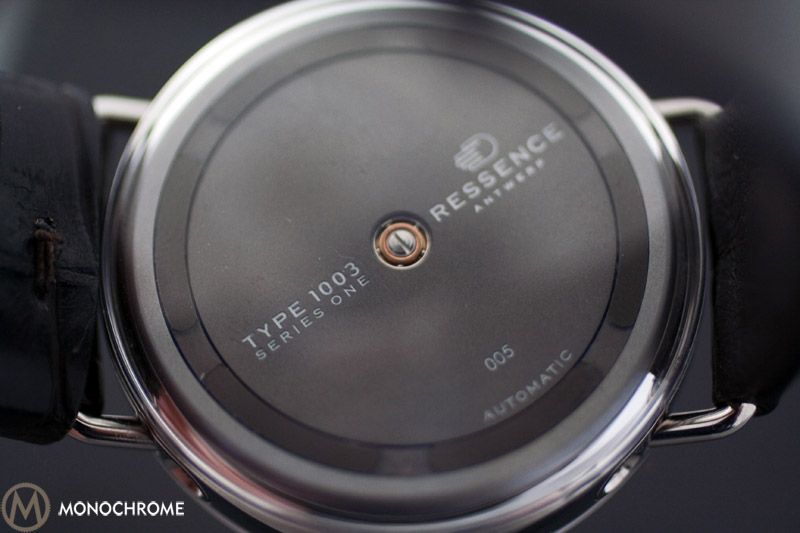
When you turn the crown, you understand why Ressence opted to adapt the ETA 2824-A2 with its additional torque. You can feel the drag of the dials, which are much heavier than conventional hands. The crown turns more like a crank, leaving the impression that some serious customization lies within. How much? Who knows? Despite a transparent caseback, a full-length rotor conceals the proprietary workings underneath. Why have a see-through caseback if there is nothing to see?
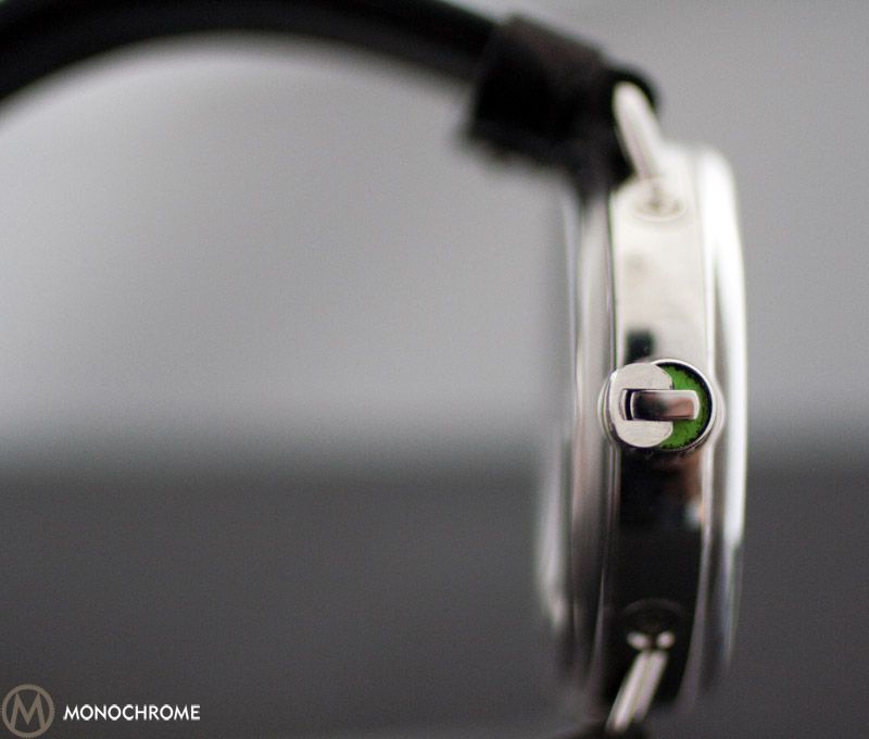
To set the time, the crown latch must be unlocked, and the watch has an ingenious locking concept. When locked, the latch is invisible, needing a fingernail to flip it open. Opening the crown reveals a green-for-go background (each Type has its own color), and the dance of the planets can begin. When setting the time, you get the fast forward view of the disks rotating.
?
Finding a Ressence is the challenge because the entire Series One was limited to 150 pieces, and only 6 are Type 1003. The Series One production comes in Types 1001-1005 with a variety of dial colors: 1001 (black dial), 1002 (silver dial), 1004 (slate dial) and 1005 (similar to the 1003, but has a decidedly easier color to produce and uses an aluminum instead of titanium dial). The Type 1003’s rareness is due to the prowess required to produce the dial’s color, limiting its construction. If uniqueness is your priority, then the Series One fits the bill, but the Type 1003 is in a different galaxy altogether, an astronomical anomaly. There are only six! Now that the watch has left, I am in mourning, grieving the loss of wearing a horological achievement.
The Verdict: Pros and Cons
Pro:
- A satellite design born out of an industrial engineering approach to watches. By design, I mean aesthetics, movement, and the novel conception of telling time.
- The chameleon grey/brown dial color.
- Its sheer simplicity, which limits what one can identify to praise, but equally makes that praise all the more significant.
- A quality alligator strap with an equally distinctive color and a patented clasp.
- The lume.
- At $19,500, the watch is priced fairly given its originality (Opus X aside).
Con:
- The sub-dial’s polished steel rings are so polished that in direct sunlight, it is difficult to read the markings.
- I would have liked a smoother feel to turning the crown.
- Again, why have a see-through caseback if there is nothing to see?
?
Technical Specifications for the ZeroSeries:
Case:
- Diameter: 42 mm
- Height: 13 mm
- Stainless Steel 316
- Weight of Type 1001, Type 1004 & Type 1005: 110 gr. (3.87 ounces)
- Weight of Type 1002 & Type 1003: 125 gr. (4.41 ounces)
Caliber:
- Modified 2824-A2 caliber
- Hour, minute, second and am/pm indicators
- Patented system designed & developed in-house
- Triple bi-axial off-centered integrated & ?ush-mounted orbiting satellites
- 40 jewels
Crystal:
- Double 3D sapphire glass with anti-re?ective coating inside
- Thickness varies from 1.10 mm to 1.90 mm in the center as it is curved
Dial:
- Type 1001: Aluminum Alloy, black mat, anodized, white Superluminova graphics
- Type 1002: Titanium grade 5, material color, and satin finished, black graphics
- Type 1003: Titanium grade 5, natural warm color, and blasted, black or white graphics
- Type 1004: Aluminum Alloy, slate grey, anodized, white Superluminova graphics
- Type 1005: Aluminum Alloy, natural warm color, and white Superluminova graphics
Strap: Alligator, genuine carbon fiber or calf skin
A special thank you to Alexis Sarkissian of Totally Worth It for loaning me his personal watch. TWI sells Ressence, and you can find one here: http://www.totallyworthit.com/. Happy Holidays!
This article is written by Max E. Reddick, contributing writer for Monochrome Watches.

2 responses
Thanks for the review and the pics.
As I said for me it was love at first sight.
Can you enlighten me; was there a titanium version too?
And if so, is that satin finished or polished?
Geo:
All the cases are polished steel, but the Type 1003 does have a titanium dial.