Greubel Forsey Balancier Contemporain – Still GF All the Way, Just More Reasonable
A more wearable, less complex and less exuberant take on Greubel Forsey's obsessional decoration.
In the last years we have seen two very different faces of Greubel Forsey: on the one hand, we get extraordinarily complex watches with big cases and uneven shapes that look like a boxer after an unsuccessful fight night. Its famous GMT is a prime example of that. On the other hand, GF also produces watches with round cases and simpler dials. Still the same insane obsession with the best finishes possible, but less information and a more traditional arrangement. It started with the Tourbillon 24 Secondes Vision, with live pictures here, that secured the manufacture the 2016 Aiguille d’Or, the highest prize at the Grand Prix d’Horlogerie de Genéve (GPHG). That same year we saw the Signature 1, with an even simpler structure. And that’s the case of the new Greubel Forsey Balancier Contemporain.
Matters of Size
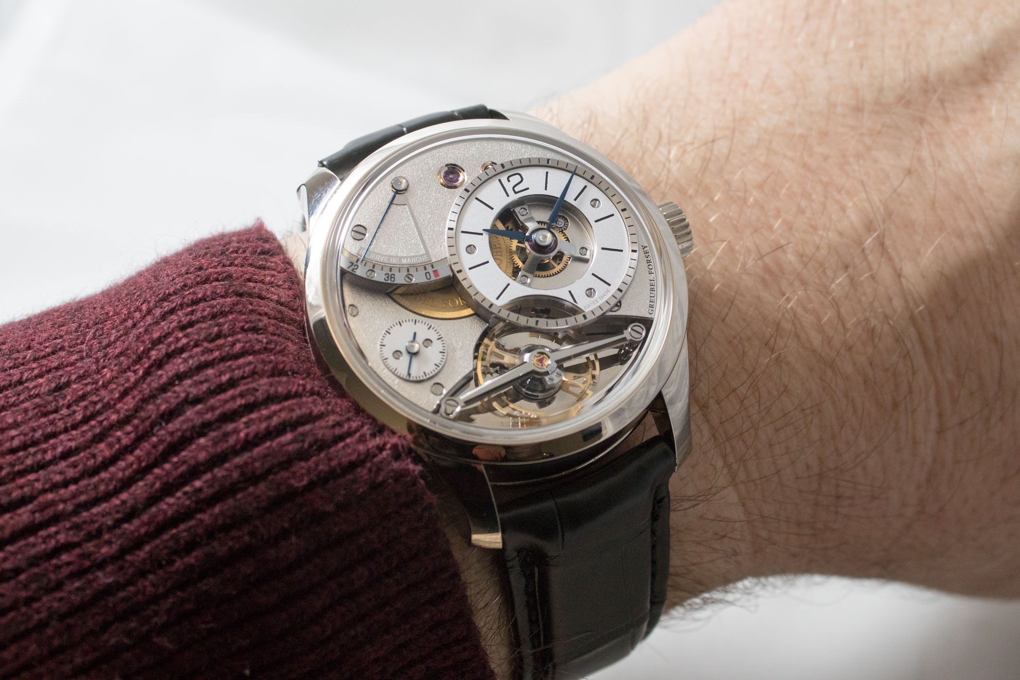
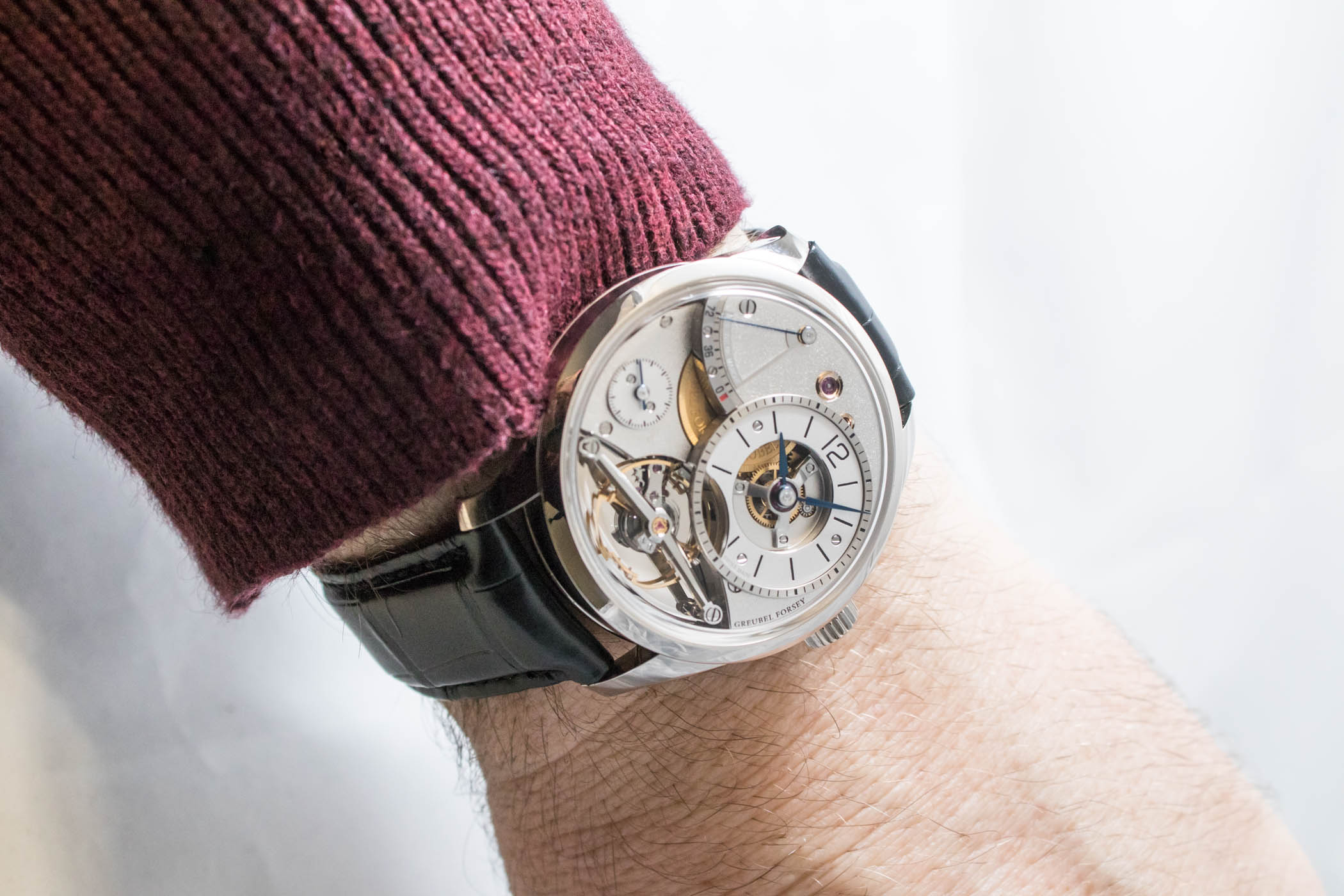
In the case of the Greubel Forsey Balancier Contemporain, the size of the case is a complication in itself, because the original idea was to fit Greubel Forsey’s signature balance wheel in a white gold suit that was only 39.6mm in diameter and 12.21mm in height – a first for the manufacture.
In 2017, Greubel Forsey presented a balance wheel – completely developed in-house, of course – with a diameter of 12.6mm to guarantee optimum chronometry. The balance rim is fitted with six gold meantime screws, recessed to guarantee optimal aerodynamics by reducing air friction. That’s the same principle that made Jaeger-LeCoultre develop its own balance wheel, whose Darth Vader Tie-Fighter shape was first presented in its 2007 Extreme Lab 1, and now can be seen in the Geophysic models (here with live pics). It also offers the added advantage of being easier to adjust by the watchmaker. This balance wheel was first presented by Greubel Forsey in 2017, in the Balancier (you can find live pics here). But the 2017 Balancier had a 43.5mm diameter, and in watchmaking, 3.9mm is a whole world.
The mission for the Balancier Contemporain was to take on board the large in-house balance wheel along with the rest of elements in a harmonious fashion. The watch had to be aesthetically pleasing but functionally effective, with visible elements and simple and instantaneous time readings. And it had to be built to GF’s standards: with the brand’s signature tri-dimensional architecture for depth.
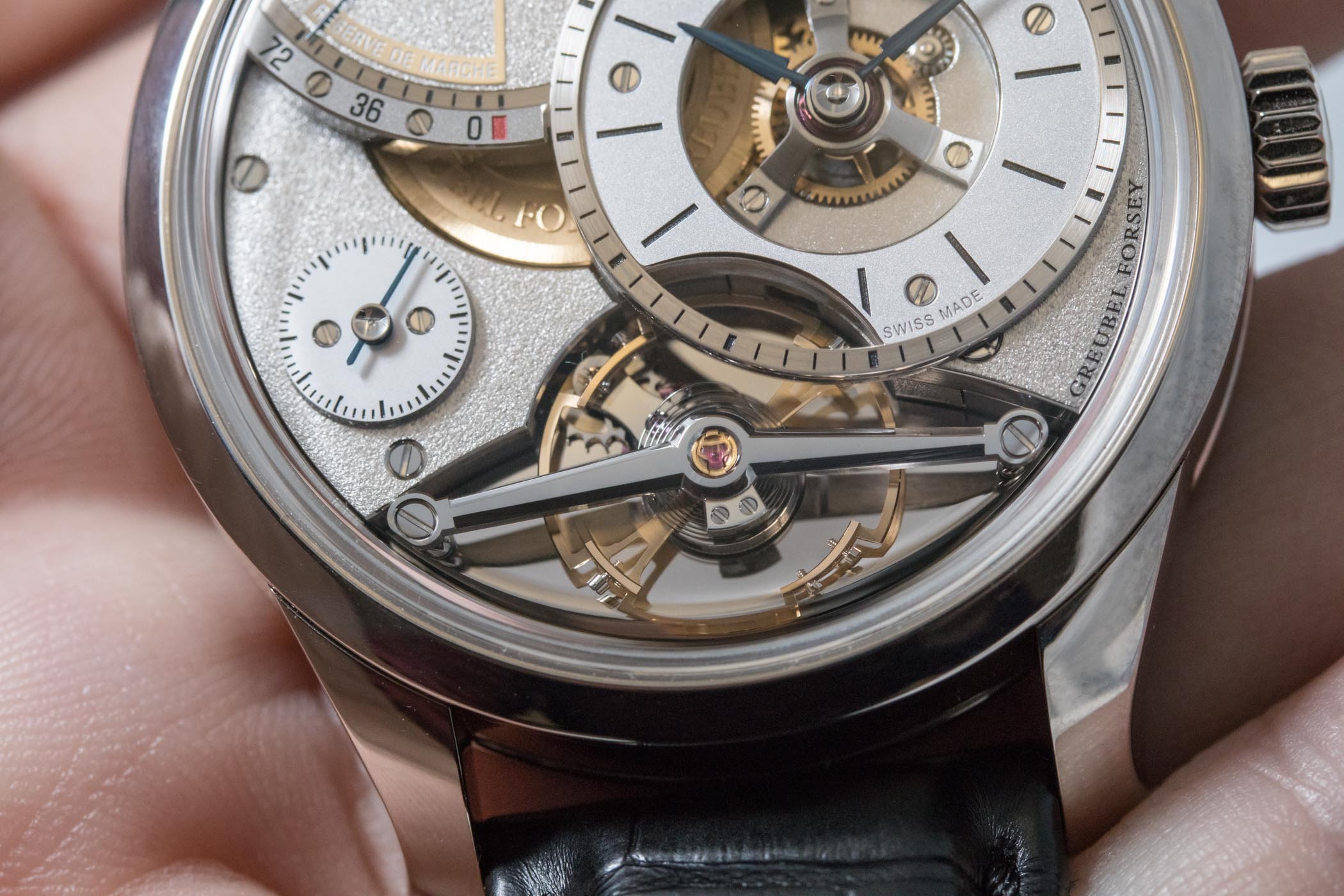
New distribution on the dial
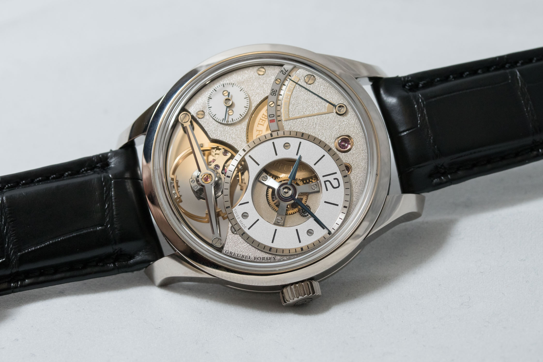
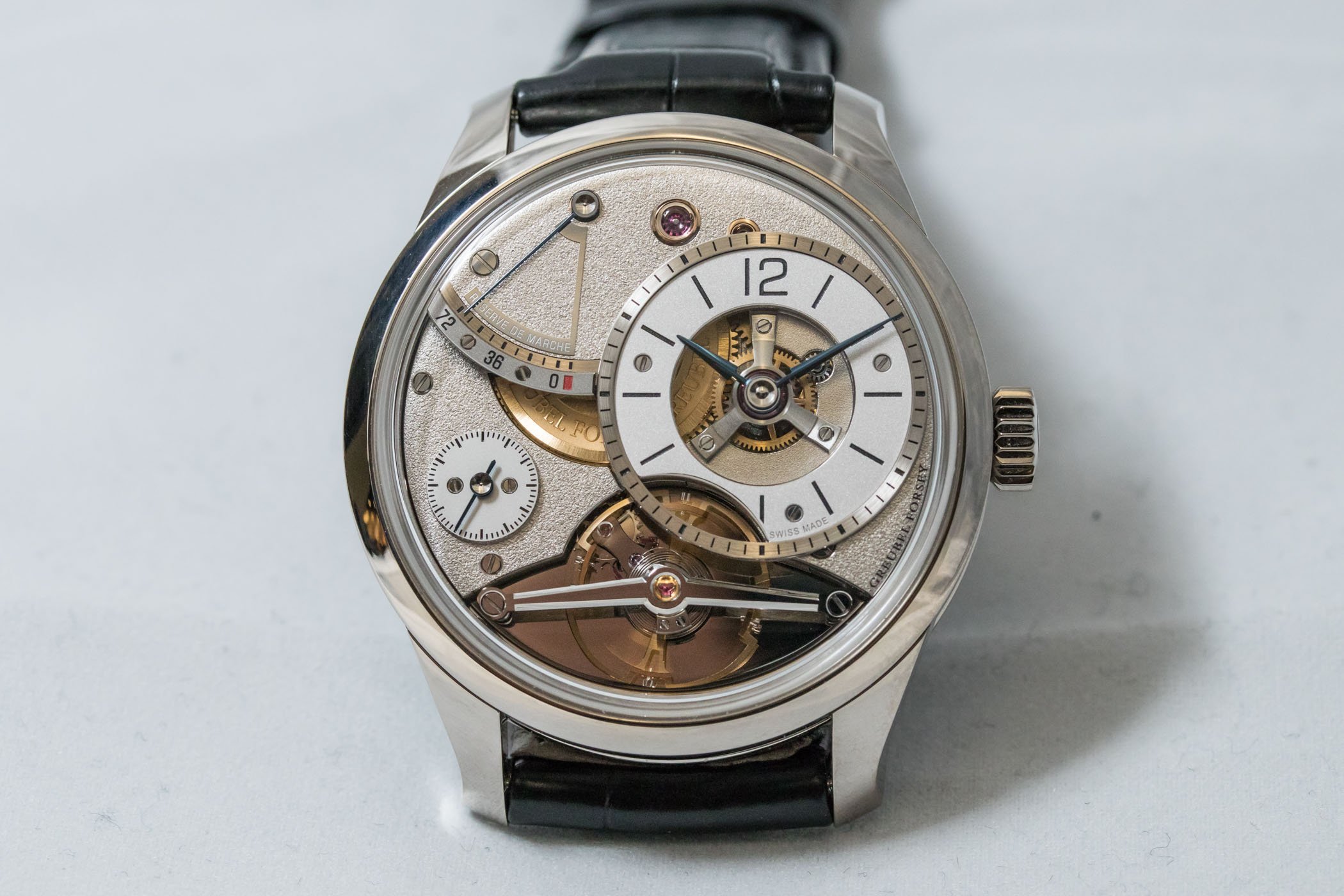
The hours and minutes counter is located at the 2 o’clock position and features blued-steel hands with hand-polished countersinks and flat-polished centres, along with a large aperture revealing the balance wheel, gear train and a three-dimensional tripod bridge. At 10 o’clock and on a slightly lower level sits the power reserve indicator, over a hand-frosted bridge.

The extremely thin blued hand and its pivot immediately remind us of the indications used in old clocks. If we go down another level, we find the small seconds register. The frosted bridge on which it sits features an aperture to let the gilded barrel show. The balance wheel is placed above a mirror-polished bridge, and the long axis that holds it is black polished and hand-bevelled. Depending on how the light hits, the polished surfaces look black. Pure decorative madness!
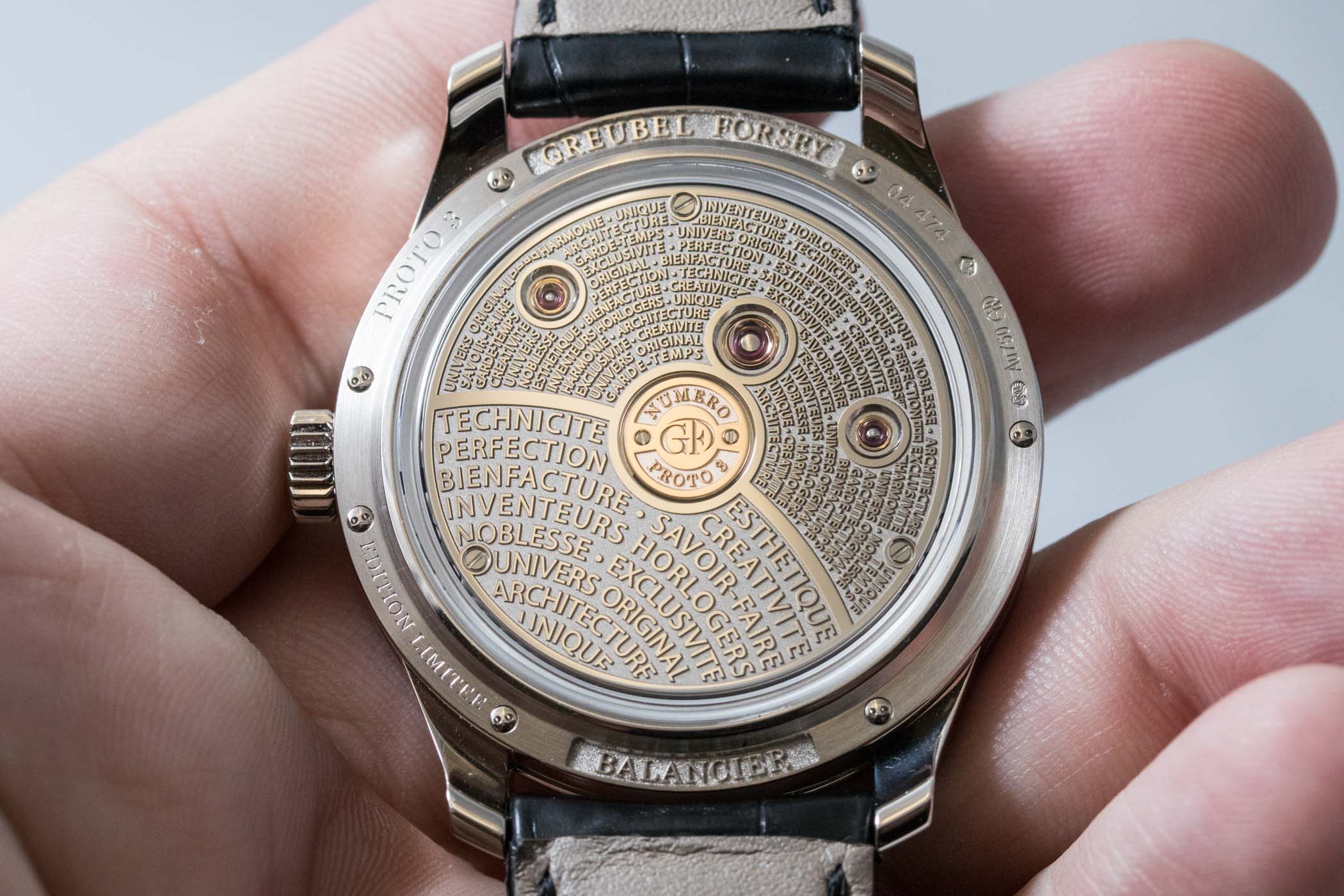
Engraved caseback
The manual-winding calibre comprises 255 components, all made and decorated by hand. The balance wheel beats at a 3Hz frequency and gets its 72-hour power reserve from two series-coupled fast-rotating barrels. But we cannot see it because it has been covered with another favourite design element of Greubel Forsey: engraved texts. Right in the centre, we find a red gold plate with the GF logo and the number of the limited edition. Surrounding the plate and on a white gold bridge, we find the credos of Greubel Forsey engraved and repeated from the outer rim to the centre, interrupted by three domed jewels in gold chatons. The caseback is secured by gold screws, and it also bears the name of the brand and of the watch.
GF Balancier Contemporain Serti
The manufacture has also launched the “Serti” version, with a 41.6mm case. The size is bigger because the bezel is paved with diamonds. What’s more, the stones are ‘mystery set’, a technique patented by Van Cleef & Arpels in 1933 in which no prongs or settings are visible. In 1938, VCA improved its own technique and managed to set stones on curved surfaces.


It must be noted that even though the case and lugs of the Greubel Forsey Balancier Contemporain Serti are set with baguette-cut diamonds, and the hours and minutes counter, as well as the small seconds, are made from mother-of-pearl, the openworked dial retains its technical nature. The bridges above and below the balance wheel have the same hand-frosted decoration as its less ornate counterpart giving the watch a more homogeneous look that is not so blingy.
Price and Availability
For this Serti model, the manufacture has not communicated the price. The standard 18k white gold version of the Greubel Forsey Balancier Contemporain has a price of CHF 195,000 (excl. VAT). It is a limited edition of 33 pieces. For more information, please visit GreubelForsey.com.
3 responses
Considering the size and overall design(except the price, which still way exceeds my budget), this is my favorite GF till now. My only gripe is the skeletonization of the hour/minute subdial, which doesn’t interests me but harms the legibility a lot.
@Chia-Ming Yang – tend to agree with you on the openworked sub-dial… Would be cleaner and easier to read with a plain dial, and also give more focus on other parts that deserve more attention. But guess that if you ask nicely, you could have a plain dial 🙂
Thanks Brice, it’s good to know I’m not the only one who thinks so.